Showing posts with label Skeletor. Show all posts

Wednesday, July 23, 2014

SpartanNerd thoughts on MOTUC and COMIC CON reveals.


Ok.!
SQUEEEEEEE!

Seriously.  I must have this.!!!.
When will they make an Attack Track?

About Tongue Lasher, he is my favorite Snake Man.  But the tongue here just looks wrong.  I prefer the paper-ish tongue on the vintage figure.
The new She-Ra looks cool…

Eldor always has looked cool.  Way better than He-Ro.
I won’t bother posting a pic of Sweet Bee.  Not interested.

Wednesday, February 12, 2014

He-Man.org Fan Poll...The Current DC Comics

You can find the poll I reference throughout this post on He-Man.org until Sunday, February 16th, 2014 at 11:00 PM EST.

The poll asks our opinions about the current comics.  I am one of those (quiet?) people who actually enjoy the new comics, while all around the web people are bad mouthing them.

Here is how I answered the poll questions.  (Everything is a scale of 1-10, 1 being worst opinion, 10 being the best.)


Overall, how do you rate the story in the current on-going DC MOTU comic?


I gave this one a 7.  I appreciate the "secret identity less" continuity they have established.  The Dark Orko thing doesn't bother me, and I feel it shouldn't bother so many others.  The idea of "the buffoon" being the big-bad isn't new, but MOTU fans don't seem to be aware of this.  They are treating Dark Orko with the dreadful criticism deserved for Scrappy Doo in the Scooby Doo movie.

GO BACK AND READ YOUR ASIMOV, People!  (OK, I'll lead you there, since you seem blind without me.  Check out "The Mule."

What I don't like is that they started the whole thing in an altered reality.  That isn't a strong place to start.  I also don't like the way they write Teela.  Hordak is OK, but far too many people have been killed off.  

They've beaten the Good Guys down over and over it seems.  There hasn't hardly been any victory.  And I like my good guys to win in Masters of the Universe.

I almost feel like this whole current main story arc is heading towards a big reset button where the comics will transform into a more comfortable, filmation-esque story.  Everything and everyone reverted back to normal.  Or maybe a part of me wishes that would happen.

Overall, how do you rate the art in the current on-going DC MOTU comic?


II rated this one at 8.  Largely the art has been pleasant.  Some of it has been sort of Avant Garde, even.  (The Origin of He-Man in particular)

The art in this book is very high level.
And I think the hottest Sorceress design appears in this book too!


I don't like all of the art.  There was one recent issue that I really hated...The one where they enter Subternia.  Nope.  Not my style.  Way too scribbly.

Here's an example.  And it seemed to decay even more as the issue neared the end.


Overall, how do you rate the story in the current DCU vs MOTU comic?


Remember this post, oh Hub City Geeks?  I was so excited...You'd think I'd give it a 10.  But I give it an 8 instead.

Well...there are a couple of things that are unclear.  Is this story really in the New 52 continuity? It is billed as it is.

What has been happening in the main continuity of the DC Universe is never referenced, hardly ever anyway.  No news of Forever Evil.  And it seems Green Lantern is with the League.  Frustrating.  Didn't he fly away after the whole mess with David Graves?

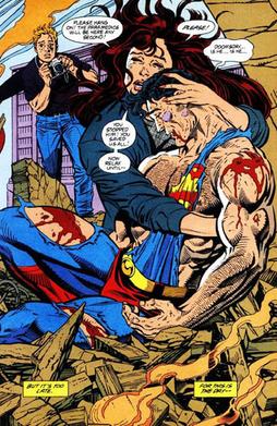
A couple of more weak things...Evil Lynn is not so good at deception.  Anyone can see a double cross coming.  Also, why wasn't Wonder Woman more angry that He-Man killed Superman?  Everyone remember this, from the Old 52?

Shouldn't more have been made of the Man of Steel's demise?


As far as I know, this is the first time Superman was killed in the New 52.  I know, I know.  It was an impostor.  Still.  It is notable.

And this has been more of a Justice League Dark story, than a Justice League (regular) story.

Gripe. Gripe.  Gripe.

What do I like?  I like that this story comes right after the Horde invasion, but before the events of Masters of the Universe #7.  It is wedged in there.  I like that Skeletor's story continues here, and that Dark Orko is revealed here.

(Shouldn't I have separated my vote from the first question?  I guess I didn't know they were distinguishing between the two titles.)

I like that Skeletor is gathering lackeys on Earth as well.  At least Black Alice.  And she has been entertaining.

You know what would be great?  In Forever Evil the Crime Syndicate keeps talking about "a being that destroyed our planet."  What if that being turns out to be...Dark Orko.

I expect Darkseid.  Or someone like that.  But Dark Orko would rectify some of the seeming inconsistencies.  Wouldn't t be cool if Dark Orko was from the Earth 3 Universe...That would be sick!  I guess we'll find out when that this month's issue ships!

(That is totally not going to happen.  DC wouldn't base their universe on Mattel's property.  Still, one could dream!)

I guess I should also mention the Unnamed One here.  There seems to be a coincidence.  The Unnamed One is Dark Orko.  And Dark Orko's origin issue ships at the same time as the Nameless One.  Sorry for any spoilers...But you probably already knew anyways.

Overall, how do you rate the art in the current DCU vs MOTU comic?

The art here is on par with all of the other DC New 52 titles.  I am fairly pleased.  I rated it 9. (It still isn't Todd McFarlane.)


How are the costume designs for the MOTU characters in the DC comics?


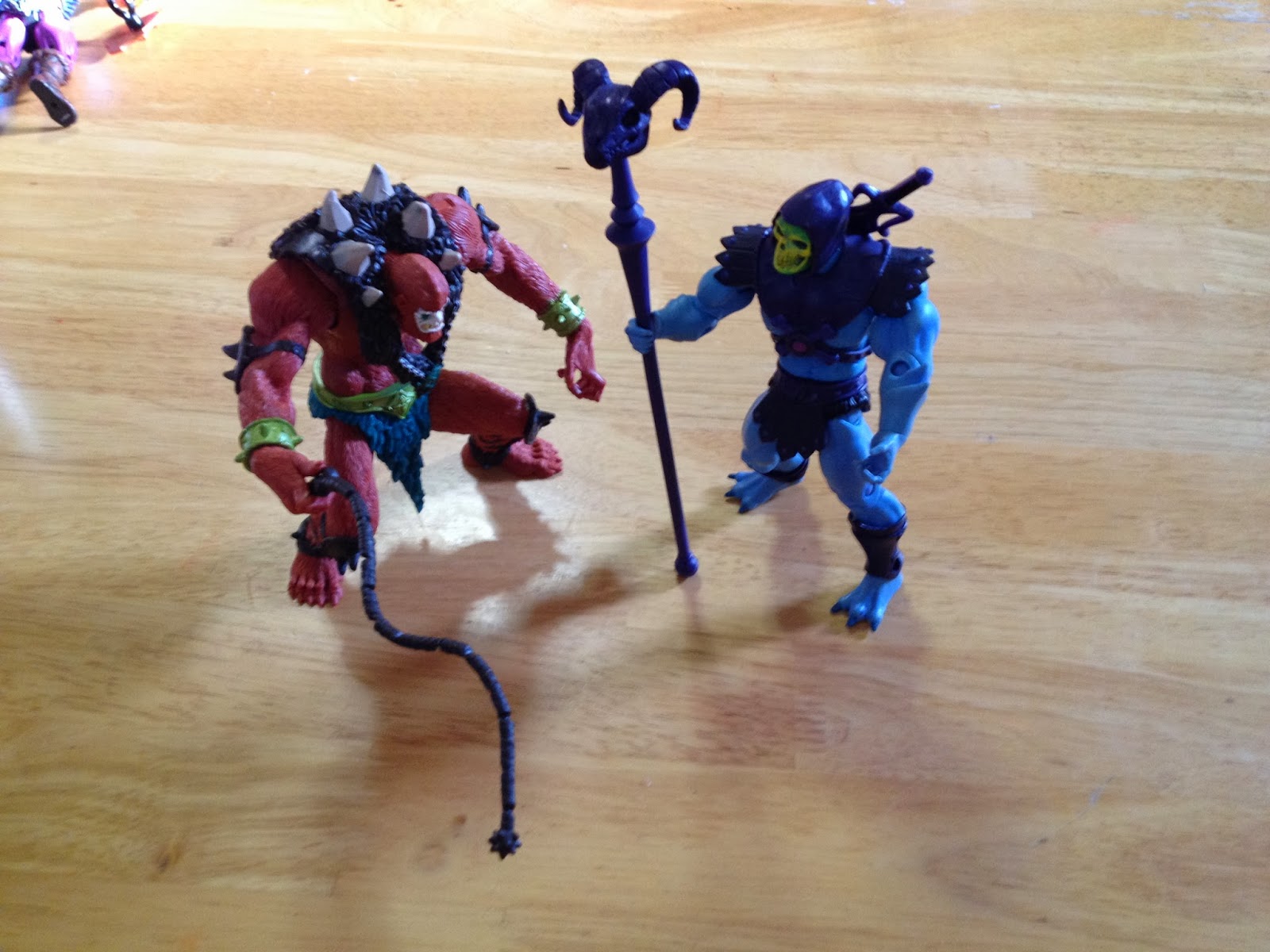
Now here is one I can be 100% behind.  I love the new designs!  It bothers me a little bit about Skeletor not having a bottom jaw, but in the same way the Joker doesn't have a face, so....


I gave this one a 10.  I hope they make figures of the Masters with these designs as well.  Maybe even a mini-subscription, like they did a couple of times before.


Do you agree with my opinions?  Let me know!  I will have to follow up and compare my votes with the final results.


Tuesday, February 4, 2014

SpartanNerd Blog...Blog Photos the way they Should Be!

I have a few really nice figures, and am always reviewing them on this blog....

But up until now, I have only used my kitchen table....Or maybe the "Protector of the Keep" playmate for Magic cards or comics.

But not anymore!

The SpartanWife got me an early Valentines present...And I was completely surprised and blown away by it.

A LIGHTBOX!

Now I can take really good pictures, and edit them like a pro!

Here is a sample!

D Arts MegaMan!


i switched out the armor on Snout Spout last week.
I like my elephant warriors to be more savage!

Teela has proven to be the hardest to photograph.
I think her face is a bit too shiny for the spotlight.  Here I gave here a cooler treatment,
with mystical blue lighting.

Here is Marvel Select Thor, with a black background and a filter.  I wanted an antique look.
I am especially fond of how the hammer turned out.

Skeletor is an interesting one to photograph.  So much detail!  This black and white filter really makes the trio of Panthor, Havoc Staff, and Skeletor feel like they came from a horror story.

A good pic of the details on Panthor's face.  The Sepia filter makes it feel bronze, or clay even.

One thing, Skeletor's eyes can hypnotize you if you stare too long at them.
There was masterful design and execution on the face sculpt and painting of Skeletor.

I think this is my favorite picture I have taken with the new equipment.  Nothing too fancy.  But it feels like the cover of a Conan the Barbarian comic book.  I tried to have Vikor hold Teela over his shoulder, but their facial expressions are too calm for that pose to work.  Still, Red is the perfect color to go behind Vikor.

I tried to get a "Catalogue" feel on He-Man and Battlecat here.  

And here he/they are.  Two Bad looks like he leapt off of the comic pages as well.


I have a lot to learn about taking pictures for reviews, and editing them as well with iPhoto or other software.  But I am off to a good start.  The lightbox is a 3X3X3 cube with two spotlights and four background colors.  I have found that sometimes the light reflects on faces a little too much, as in the case of Teela, Mega-Man, and Two-Bad above, but I was able to recover most of the time with editing.  I need to spend more time previewing before shooting, I think.  And also maybe moving the lights back or something.  I also took a few pics right before my iPhone battery died, and I believe that caused them to be a little blurrier. (I took some Pokemon pics that were unusable.)

There are also size limitations.  He-Man and Skeletor barely fit on their cats in the pics.  I cropped down what you see.  But the Griffin is way too big for the lightbox treatment.  And so is Megator, really.

Still, it is a great start and I am having a blast.  Comment on the photos!

(Also check out my recent blurb about Born of the Gods, where I also used the white reflecting material as the background for the cards.)

Oh yeah.  My rating.  The Polaroid Lightbox gets a 5/5!

It folds up for easy transport and storage into a little baggy with pouches for the lights.  It also came with a camera stand that I will have to try out when I use a real camera sometime instead of an iPhone.  I won't fault it on it's size.  Really it is perfect for most action figures, and I am a beginner.

Monday, January 20, 2014

SpartanNerd Unboxing and Review...VINTAGE ALERT! 200x Two Bad

SpartanNerd, you wanted a MOTUC Two-Bad.   Well.  Too bad!

So I will settle for the next best thing.  200x Two-Bad.

IMHO, the vintage 1980's Two-Bad was not very good.  I remember making him punch the opposite face all the time.  And that's about it.  He couldn't stand very well, because he was top heavy.  He couldn't hold weapons because his hands were permanent fists.  And his shield didn't fit on his arms correctly.  I did enjoy the power of punching with the spiny loaded arms and waist feature combined, however.  This was the strongest action feature in the original figures.

200x Two-Bad doesn't have any of those problems, and the action feature is also pretty cool.  So he is an advance in every way!

Here is Two-Bad in his original packaging.  Notice the price tag.
The dude at the Barnyard Fleamarket shaved a little off.

This back is different from Beast Man and He-Man.  We get a nice large pic of the figure.  It still has the annoying foreign languages all over the package.  They should have made a different card for the foreign languages, and gave people something else to collect, rather than this all-inclusive strategy.  I like the white outline around the figure.
I took this pic when I removed him from the packaging.  Impressive!
Two Bad has no problem standing.  The weapon is cool,
sporting a hinge between the two pieces.

No big button behind this figure.  His arms are spring loaded themselves.


Notice that the Baddra side of Two-Bad is the exact same color as Spikor!  In this pic you can see that Two-Bad is noticeably shorter than the MOTUC figures.  :(  Also, both heads seem a tad smaller than He-Man and Beast Man's heads.

Here is a shot of all of my baddies together.  The best thing about Two Bad is he helps fill my ranks a bit!


So, what is my rating of Two-Bad?  I like that he is an improvement on the 1980's figure in every way.  His arms are way better.  The Horsemen sculpted him, and he is very detailed.  He has excellent weapons.  He stands nicely.  The only point was taken off because of his slightly off scale build, which was probably done to save money on a fig that was fully tooled.

I rate 200x Two-Bad 4/5.  Do you agree?  Let me know!

SpartanNerd Unboxing and Review....VINTAGE ALERT! 200x Beast Man.

I am going to call this new variety of column VINTAGE ALERT.

Some people might argue that 200x Masters of the Universe toys are not vintage.  But they are approaching fifteen years old, people!  They ARE NOT fresh and new.

From now on, when I get to review a vintage toy, I am going to all-caps VINTAGE ALERT!

Because it's my blog.  That's how I roll!

I am going to start with the package.

The card evokes the feeling of nostalgia for the 1980's line.  Beast Man is clearly visible in the package.  The package is covered in text as well, in english and two other languages.

Here is the back of the package.  This packaging is familiar to me because
I have the rare variant "cross-harness" He-Man MOC hanging in my office!
I have only owned a few 200x figures before.  My brother Hoagie Boagie had 200x as HIS He-Man and the Masters of the Universe.  I will say that I enjoy the Mike Young Productions cartoon quite a bit.  And I am glad to see the Four Horsemen't work on these figures as well.  So there are a few loose He-man and Skeletor figures floating around.  But no other characters.

On with the review.

Here is Beast Man out of the package.  Notice his arms and legs.  This figure is NOT super-articulated.  He has two accessories.  The whip and his armor.  The armor fits on him loosely, and is made of the same rubber as the whip.  The whip is quite flexible, and really "whips" good with the action feature.

On the back, you can see a lever sticking out.  When you press this lever,
it causes his arms to move simultaneously.  So he can crack that whip!  Action features like this
were what Mattel thought kids wanted.


Beast Man can control animals, right?

He is famous for conjuring Griffons to help the baddies make an escape.  Here he is riding and whipping my griffin!  He doesn't fit on the saddle great, but his loin cloth is soft enough to position right.

Beast Man seems to be a good scale to ride on the Griffin, and that pleased me very much!  So how does he look next to Skeletor?


Skeletor seems to stand about a half-head taller than Beast Man.  BUT, Beast Man is hunched over a little.  Which is fitting for the character in relation to Skeletor.


So what's my rating?  I am going to take into account that super-articulated figures weren't the big thing necessarily at the time these were produced.  (200x He-Man figs were marketed at kids more than adults.)  I am going to take into account that he looks pretty good with the MOTUC characters.  The same sculptors, after all!  I am also pleased that he fits on the griffin, and looks fantastic.  (If you are a regular reader, you know I wanted Vikor to ride it, but his loincloth was too stiff.)  I kind of wish the spikes on his arms and knees were removable, but I don't think it is necessary enough to take off a point, considering the time it was released.

So, my rating is 5/5!  He serves the grand purpose of making my bad guys seem to have more of a team.  I will probably not have a MOTUC Beast Man any time soon.  What do you think?  Leave a comment!


Tuesday, December 31, 2013

Masters of the Universe Classics Unboxing and Review...Weapons Rack!

Happy New Year!  Do you now have swag stacked upon boxes piled up on returns as well as items not yet sitting in a permanent spot?

My MOTUC characters have been like this for awhile...extra weapons scattered about, or stored away in a little baggie.  But not anymore!  Here is my review of the MOTUC Weapons Rack!


I wondered if this box was going to say "Weapons Rak."
It was misspelled on the Matty Collector Website!
The Weapons Rack was something I wanted when it came out, but couldn't fork over at the time.  And the way that Mattel does things, it disappeared and I never had a chance to get it again.  With Castle Grayskull having been on sale (didn't sell out as they predicted, did it?), They wanted to be sure that people could display the castle with the proper Weapons Rack.  After all, the vintage version CAME with a weapons rack, which is what this thing I bought is modeled after.

(I have not purchased a MOTUC Castle Grayskull.  There are a couple of problems. 1.I don't have that many figures.  2. It costs way too much.  3. Where would I put it?  I do however, think it is terrific, and am glad they made it.  Maybe someday I will have it.  But there are other ways I have to spend $300 + shipping right now.  I am a cheapskate, remember?)

Here's what you see when you open the box.  A nice window on card,
featuring the furniture and the weapons, packed in weapons pack style.

This is what is on the back.  Oddly, only one palace guard?
Here is a picture of the weapons that came with it.  The red ones are especially nice!  The silver ones have a little patina to them, that might not be coming through in my picture.  The silver ones are supposed to be an homage to the original weapons that came with Castle Grayskull, and the red ones are supposed to be an homage to "Man-E-Weapons."
Here is the rack, with nothing on it.
Rows of pegs to display your weapons!

Here is how I set it up at first.  Front view.  I like how there is a little post to put
the shields on on both sides, as well as pegs to hang some weapons on the sides.

Here is the back view of my initial setup.
Here you can see the mace hanging on the right side.
How do other weapons work with this, that is, other than those that came with it?  I decided to do a good and evil theme!

My evil theme!

My good theme!
What are the limits of the weapons rack?  I went and found all kinds of MOTUC weapons to load it down with!  Here is a front and back view!  Read the captions for a contest!


Can you identify all of these weapons, readers?!  Send a comment for prize!

I will respond back and you can send me your address!  (The prize will go to whoever names the most.  Look at both the front and back view pictures, please.)  

This weapons rack is worth fighting for!
My rating for the Weapons Rack?  5/5!  It is a superb sculpt, serves its purpose well, and looks amazing with the figures.

Thursday, December 12, 2013

Masters of the Universe Classics Unboxing and Review....The Griffin!

Remember my review of Megator?

Well I think I have an even more impressive figure to review, now!  The GRIFFIN!

The Griffin is AMAZING!  Who would have thought we could get this?  And it seems very calculated as well, being an amalgamation of Battle Cat and Swift Wind.

In the Mike Young cartoon, griffins were the bad guy's main mode of escape.  They would start to lose, and the griffins would swoop in and grab the villains and take them to safety.

This creature absolutely fits in my nerd closet with the Magic cards and other stuff like that.  I'd bet I have several dozen Griffin Magic cards...

When I first saw the Griffin, I thought, "Do I really want that?"  Then I got Vikor, and thought, "The Griffin would be a great ride for Vikor."  It didn't take too long for me to figure out, Vikor isn't riding any steed, with that loincloth.  But it was worth a try.

I got the Griffin as a part of the Cyber Monday sale, as mentioned on the Groovy Dork List.  And am I glad I did!  This figure is the most impressive figure I may own!


He came in this big box.  It is so big, I decided to use it as a background!

Here he is in his ugliness!  Awesome ugliness at that!

When you take him out of the box, you see that you have to assemble the wings to his body.

Here he is, ready to fly!

Don't call him four-eyes!

He has a double tail...the kind of thing that was favored on the MYP show.

I don't own a Beast-Man, so Spikor will have to do.  Ugly riding Ugly!

I dreamed of putting Vikor on the Griffin.  Alas, his loincloth was too much.
Even with the saddle off.  This was the best I could do.  It kind of looks like
Vikor is going to slay him in this picture...

You can see that he has a cool mane.  His backside is just the Battle-Cat buck, with chicken feet.

What do Griffin's eat?  Temple of Darkness Zoar!  (not included of course)

Here is an overhead shot.  This figure is HUGE!
I give the Griffin a 5/5!  He is solid.  Huge.  Fits in most contexts.  Ugly in a beautiful way.  He is one of the best figures I own as far as sculpt, displayability, playability, and on and on!