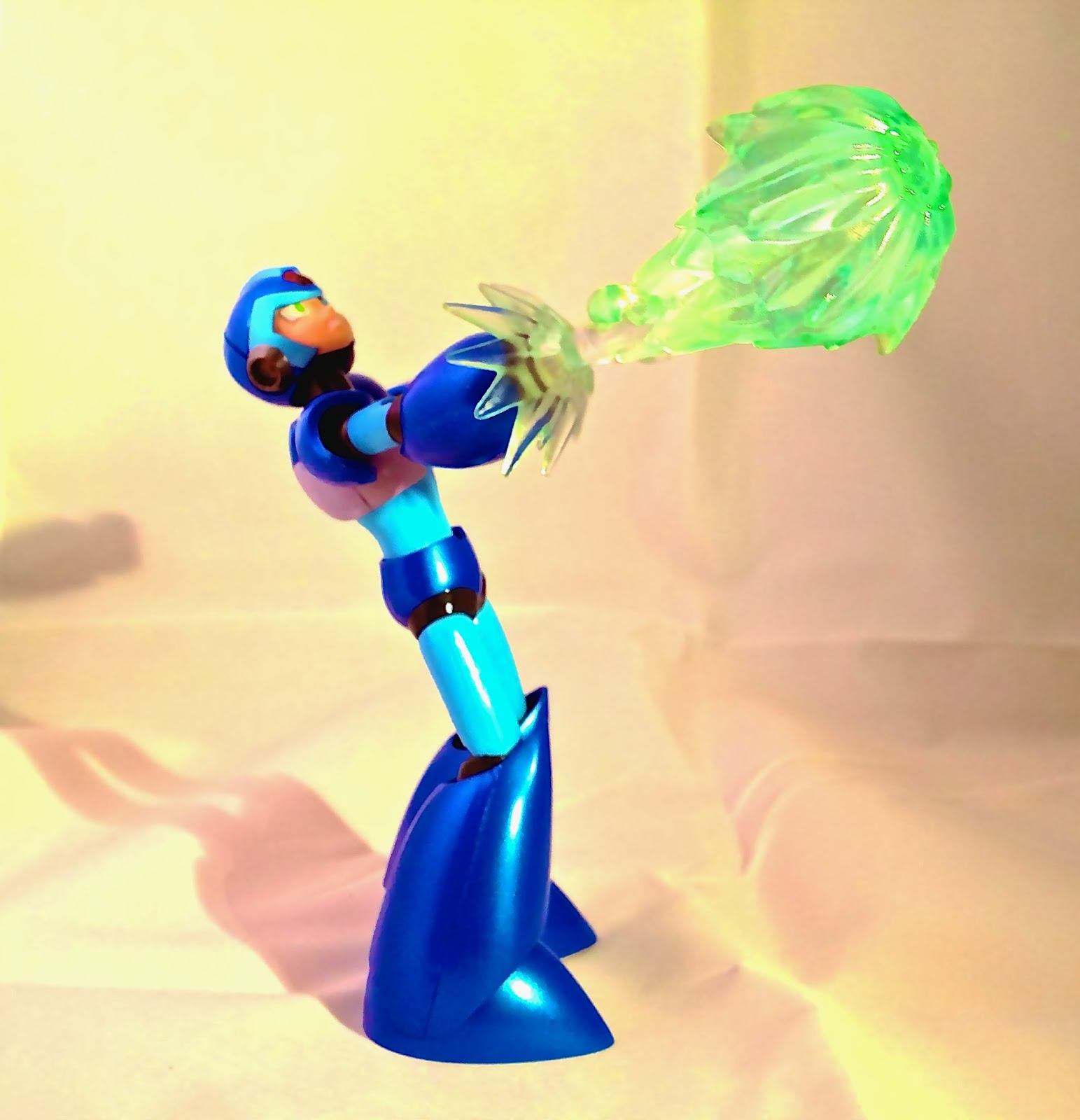
But up until now, I have only used my kitchen table....Or maybe the "Protector of the Keep" playmate for Magic cards or comics.
But not anymore!
The SpartanWife got me an early Valentines present...And I was completely surprised and blown away by it.
A LIGHTBOX!
Now I can take really good pictures, and edit them like a pro!
Here is a sample!
 |
| D Arts MegaMan! |
 |
| i switched out the armor on Snout Spout last week. I like my elephant warriors to be more savage! |
 |
| Teela has proven to be the hardest to photograph. I think her face is a bit too shiny for the spotlight. Here I gave here a cooler treatment, with mystical blue lighting. |
 |
| Here is Marvel Select Thor, with a black background and a filter. I wanted an antique look. I am especially fond of how the hammer turned out. |
 |
| Skeletor is an interesting one to photograph. So much detail! This black and white filter really makes the trio of Panthor, Havoc Staff, and Skeletor feel like they came from a horror story. |
 |
| A good pic of the details on Panthor's face. The Sepia filter makes it feel bronze, or clay even. |
 |
| One thing, Skeletor's eyes can hypnotize you if you stare too long at them. There was masterful design and execution on the face sculpt and painting of Skeletor. |
 |
| I tried to get a "Catalogue" feel on He-Man and Battlecat here. |
 |
| And here he/they are. Two Bad looks like he leapt off of the comic pages as well. |
I have a lot to learn about taking pictures for reviews, and editing them as well with iPhoto or other software. But I am off to a good start. The lightbox is a 3X3X3 cube with two spotlights and four background colors. I have found that sometimes the light reflects on faces a little too much, as in the case of Teela, Mega-Man, and Two-Bad above, but I was able to recover most of the time with editing. I need to spend more time previewing before shooting, I think. And also maybe moving the lights back or something. I also took a few pics right before my iPhone battery died, and I believe that caused them to be a little blurrier. (I took some Pokemon pics that were unusable.)
There are also size limitations. He-Man and Skeletor barely fit on their cats in the pics. I cropped down what you see. But the Griffin is way too big for the lightbox treatment. And so is Megator, really.
Still, it is a great start and I am having a blast. Comment on the photos!
(Also check out my recent blurb about Born of the Gods, where I also used the white reflecting material as the background for the cards.)
Oh yeah. My rating. The Polaroid Lightbox gets a 5/5!
It folds up for easy transport and storage into a little baggy with pouches for the lights. It also came with a camera stand that I will have to try out when I use a real camera sometime instead of an iPhone. I won't fault it on it's size. Really it is perfect for most action figures, and I am a beginner.


No comments:
Post a Comment
Comment, oh Hub-City Geeks!